Customizing Component Appearance
Every Form Builder Components have a styling option; some of them are unique. This chapter covers the following Component's styling options:
- Button
- File Input
Horizontal alignment, horizontal and vertical placement, and form cell resizing are common settings in every component.
Button Customization
To customize a button component:
- Drag and drop a button component/function to the Form Area
- Click on the Field Settings button

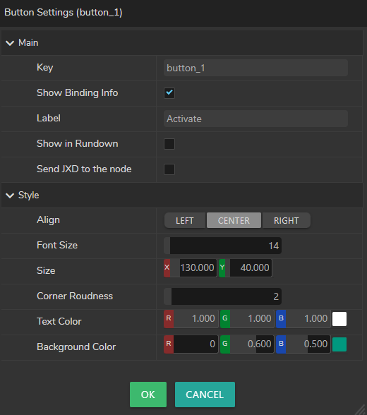
As the image above shows that you can customize the Background Size, Color, and Corner Radius along with the Text Size and Color.

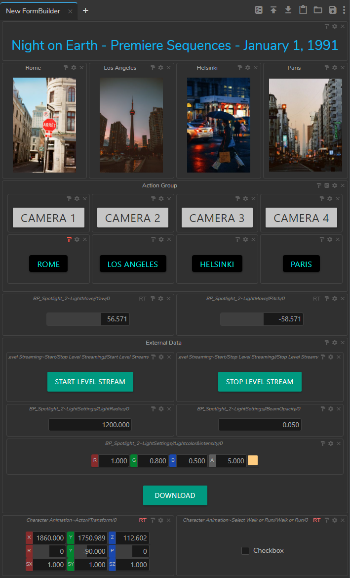
The image above shows an example of how you can utilize Button Components in your production pipeline.
File Input Customization
To customize a File Input component:
- Drag and drop a File Input component to the Form Area.
- Click on the folder icon and select an image

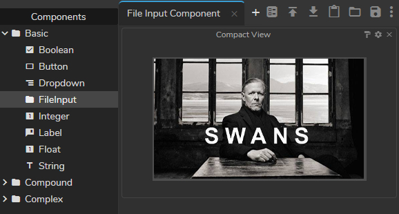
Your file Input component should look similar to the above example. Now:
- Click on the Field Settings button
- Select the Compact View option and click OK

As the above image shows, the compact view option allows you to check your visuals in wider resolution.
Clicking on the image inside the File Input property pops up the Asset Browser.