Plot
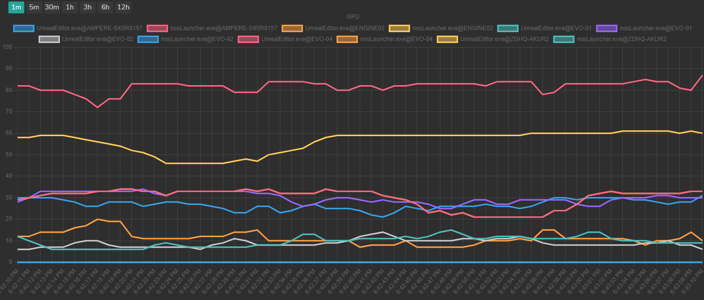
The Plot submodule provides a graphical representation of your system metrics/usage trends over time. This dynamic graph offers insights into the performance and behavior of various metrics monitored by the Hardware Monitor module.

Plot graphs provide a visual overview of how your system metrics fluctuate over time, enabling you to identify trends, anomalies, and patterns in your hardware and software performance.
- X-Axis: The horizontal axis of the graph represents time, with each tick mark corresponding to a specific time interval. The time range displayed can be adjusted, ranging from one minute to 12 hours, depending on your selection.
- Y-Axis: The vertical axis of the graph represents the metric's usage or value. The scale adjusts dynamically based on the selected metric. For metrics represented as percentages, the scale ranges from 0% to 100%. For other metrics, such as data transfer rates or memory usage, the scale adjusts automatically to accommodate the maximum value reached during the selected time range.